Wendy’s, a beloved fast-food haven known for its square hamburgers and the famous Frosty, had a humble beginning with just five menu items. The brand and its offerings have grown remarkably since those early days, but interestingly, the logo has stayed relatively consistent over the years. About ten years ago, however, Wendy’s gave its logo a facelift, nudging its familiar red-haired mascot into a new era.

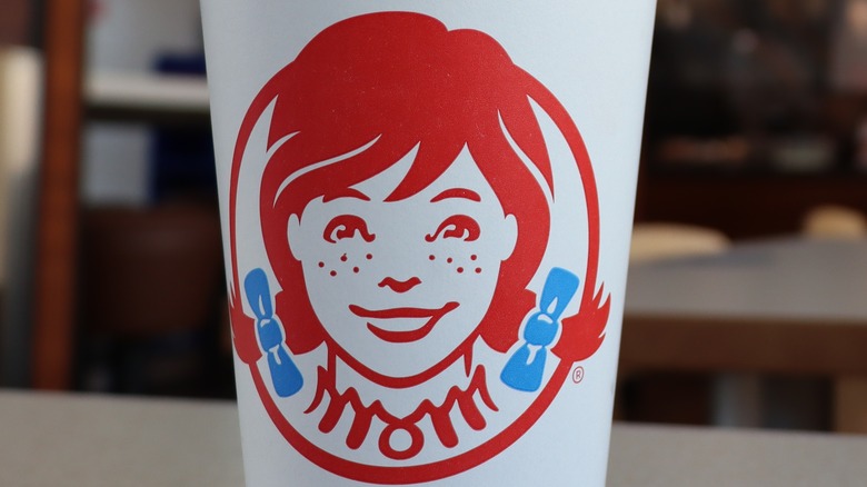
Many recognize the bright red braids of Wendy’s mascot as a beacon for delicious fast food. Yet, few might know that Dave Thomas, the founder, had some regrets about the name choice, fearing it might pressure his daughter, who inspired the mascot. There’s also a bit of a logo mystery that spurred discussion—could the word “mom” be hidden in the little girl’s dress design? As it turns out, this “mom” phenomenon was pure coincidence.
A Mother’s Love in Every Bite

Family was always at the heart of Dave Thomas’s vision, with the restaurant named after his daughter. The logo, meant to reflect her youthful self, also seemed to unintentionally feature the word “mom” nestled in the girl’s ruffled collar. While some customers were convinced this was a deliberate nod to maternal warmth, Wendy’s officials clarified that the apparent “mom” was an unplanned coincidence.
Business Insider pointed out how this coincidental word is more visible in the red version of the logo, especially on the cups. Despite the speculation, a Wendy’s representative assured everyone that there was no hidden purpose behind it, saying they simply found it “interesting” that Wendy’s cameo appeared to have “mom” on her collar but insisted it wasn’t intentional.
The Past and Present of the Wendy’s Logo

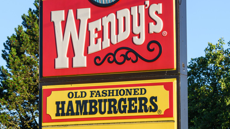
Named after Dave Thomas’s daughter, Melinda “Wendy” Thomas, the franchise has kept its original naming since its inception in 1969. However, its logo and slogan have undergone several changes. In the early 2000s, the promise of “Old Fashioned Hamburgers” was dropped. The phrase “Quality is our recipe,” which appeared in the 1971 redesign encircling Wendy’s head, was omitted again in 2012 with the newest logo iteration. This latest design focuses on a close-up of Wendy’s face, using a more playful, handwritten font, contrasting the previous bold block lettering.
While the “mom” in Wendy’s is simply a coincidental twist, other food logos also incorporate hidden elements that are quite clever. For instance, in the Baskin-Robbins logo, you might notice a “31,” referring to the range of flavors they offer. Likewise, with Tostitos, the logo cleverly features two people enjoying chips with salsa—the two ‘t’s sharing a chip, while the dot on the ‘i’ serves as the dipping salsa. These subtle designs add a layer of fun to their branding.


